
The world of web design has evolved tremendously in recent years, with website mockups playing a crucial role in the development process. These visual representations serve as blueprints that guide designers and clients alike, ensuring that everyone involved in a project shares a unified vision before any code is written. By examining real-world examples and understanding the principles behind effective design, you can transform your digital presence into something truly remarkable. Whether you are a business owner seeking to establish a compelling online identity or a designer aiming to refine your craft, the insights shared here will help you navigate the intricate landscape of contemporary web design with confidence and creativity.
Understanding website mockups: 12 inspiring examples for modern web design
What Makes an Effective Website Mockup in Today's Digital Landscape
A website mockup is far more than a simple sketch or rough outline. It represents a detailed visual draft that captures the essence of what a finished website will look and feel like, encompassing everything from colour schemes and typography to layout structures and interactive elements. In today's digital landscape, an effective mockup must communicate both aesthetic appeal and functional clarity. It should enable stakeholders to visualise the final product whilst providing designers with a clear roadmap for implementation. The best mockups strike a delicate balance between creativity and practicality, ensuring that every design decision is intentional and aligned with the overall objectives of the project. They also serve as a communication tool, bridging the gap between abstract ideas and tangible outcomes, making it easier for teams to collaborate and iterate on concepts before committing to development.
One of the key attributes of a successful mockup is its ability to reflect the brand identity of the organisation it represents. Every colour, font, and image should resonate with the core values and messaging of the business, creating a cohesive visual narrative that speaks directly to the target audience. Additionally, an effective mockup incorporates user experience considerations, such as intuitive navigation and clear calls to action, ensuring that visitors can easily find the information they need. It should also demonstrate responsiveness, showcasing how the design will adapt across different devices and screen sizes. By addressing these elements early in the design process, teams can identify potential issues and make informed decisions that enhance the overall quality of the final product.
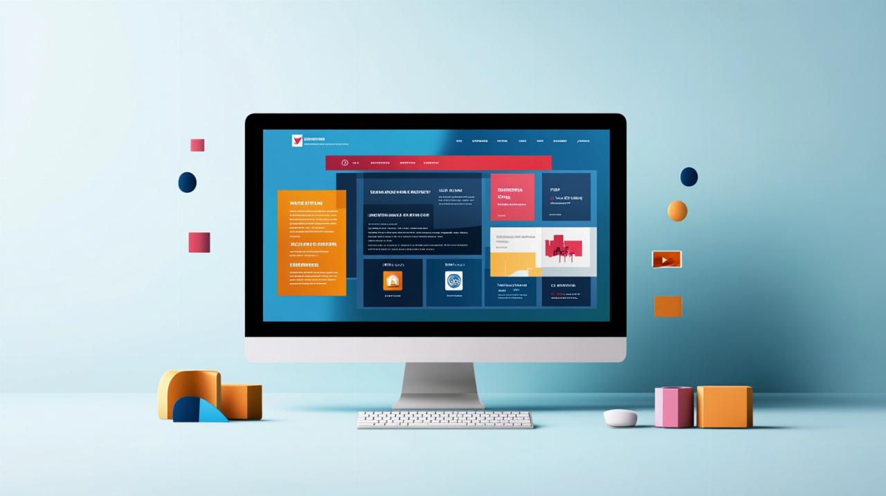
Exploring 12 outstanding website mockup examples across various industries
Examining a diverse array of website mockup examples provides invaluable insights into the myriad ways designers approach different challenges. In the realm of e-commerce, mockups often emphasise product imagery and streamlined checkout processes, creating an environment that encourages conversions whilst maintaining visual appeal. For instance, a fashion retailer might present a mockup featuring large, high-resolution photographs set against minimalist backgrounds, allowing the merchandise to take centre stage whilst guiding users effortlessly through the purchasing journey. This approach not only highlights the quality of the products but also reinforces the brand's commitment to elegance and simplicity.
In contrast, corporate websites typically favour a more structured and professional aesthetic. A technology consultancy, for example, might develop a mockup that incorporates clean lines, ample white space, and a restrained colour palette to convey trustworthiness and expertise. Such designs often include clearly defined sections for services, case studies, and client testimonials, all arranged in a logical hierarchy that facilitates easy navigation. The use of bold typography and strategic visual cues helps direct attention to key messages, ensuring that visitors quickly understand the value proposition and the company's unique strengths.
Creative portfolios represent another fascinating category, where designers have the freedom to experiment with unconventional layouts and dynamic visuals. A graphic designer might craft a mockup that features overlapping images, asymmetrical grids, and vibrant colour contrasts, all working together to showcase their versatility and artistic flair. These mockups often prioritise visual storytelling, using imagery and animation concepts to create an immersive experience that leaves a lasting impression on potential clients. Meanwhile, educational platforms tend to focus on clarity and accessibility, employing intuitive interfaces and well-organised content structures that cater to learners of all ages and abilities.
Non-profit organisations frequently opt for mockups that emphasise emotional resonance and calls to action. A charity dedicated to environmental conservation, for instance, might present a design featuring powerful imagery of nature, complemented by compelling narratives and prominent donation buttons. The mockup would aim to inspire visitors to take immediate action, whether by contributing funds, volunteering, or sharing the organisation's mission with others. Similarly, hospitality brands often showcase mockups that highlight stunning photography and user-friendly booking systems, creating an inviting atmosphere that encourages potential guests to explore further and make reservations.
Media and publishing websites benefit from mockups that prioritise content delivery and readability. A news portal might present a layout with bold headlines, prominent featured images, and clearly delineated sections for different categories of content. The mockup would demonstrate how readers can effortlessly browse articles, watch videos, and engage with multimedia elements, all whilst maintaining a cohesive visual identity. Health and wellness sites, on the other hand, often employ calming colour schemes and gentle imagery, with mockups that emphasise trust and empathy. These designs typically include easy-to-navigate menus, informative resource sections, and integrated appointment booking features that cater to the specific needs of their audience.
Finally, entertainment and lifestyle brands frequently push creative boundaries with their mockups, incorporating bold typography, vibrant gradients, and playful animations. A music streaming service, for example, might develop a mockup that features dynamic playlists, artist profiles, and personalised recommendations, all presented in a visually striking interface that captures the energy and excitement of the industry. By exploring these twelve diverse examples across various sectors, designers and business owners alike can gain a deeper appreciation for the endless possibilities that exist within the realm of website mockups, inspiring them to create designs that are both innovative and effective.
5 essential tips for successful web design that enhance user experience
Mobile-friendly design principles every contemporary website must embrace
In an era where mobile devices account for a significant portion of web traffic, ensuring that your website is optimised for smartphones and tablets is no longer optional. A mobile-friendly design begins with a responsive layout that automatically adjusts to fit the screen size of the device being used. This means that images, text, and interactive elements should resize and reposition themselves seamlessly, providing a consistent and enjoyable experience regardless of whether a visitor is browsing on a desktop computer, a tablet, or a smartphone. Embracing this principle from the outset of the design process ensures that your website remains accessible and functional for all users, thereby maximising engagement and reducing bounce rates.
Another critical aspect of mobile-friendly design is the consideration of touch-based navigation. Unlike desktop users who rely on a mouse and keyboard, mobile users interact with websites through taps, swipes, and pinches. This necessitates the creation of larger, easily tappable buttons and links, as well as the implementation of gestures that feel natural and intuitive. Designers must also pay close attention to loading times, as mobile users often operate on slower or less reliable connections. Optimising images, minimising the use of heavy scripts, and leveraging browser caching are all strategies that contribute to faster load times, which in turn enhance the overall user experience and improve search engine rankings.
Optimising Layout, Typography, and Visual Hierarchy for Maximum Impact
The layout of a website serves as the foundation upon which all other design elements are built. A well-structured layout guides visitors through the content in a logical and effortless manner, ensuring that they can quickly locate the information they seek. Effective layouts employ grids and alignment principles to create a sense of order and balance, whilst strategically placed white space prevents the design from feeling cluttered or overwhelming. By carefully considering the placement of headers, images, text blocks, and calls to action, designers can direct the viewer's attention and encourage desired behaviours, such as making a purchase or signing up for a newsletter.
Typography is another powerful tool in the designer's arsenal, capable of conveying mood, establishing brand identity, and enhancing readability. Selecting the right typefaces involves balancing aesthetic appeal with functionality, ensuring that text remains legible across all devices and screen sizes. Designers should limit the number of different fonts used within a single project to maintain visual coherence, whilst varying font weights and sizes to create emphasis and hierarchy. Line spacing, letter spacing, and paragraph alignment all play crucial roles in determining how easily visitors can consume content, with well-chosen typographic settings contributing to a more pleasant and engaging reading experience.
Visual hierarchy refers to the arrangement and presentation of elements in a way that communicates their relative importance. By employing contrasting colours, varying sizes, and strategic positioning, designers can guide the viewer's eye towards the most critical information first. For example, a bold headline in a large font will naturally draw attention before a smaller block of body text, whilst a brightly coloured call-to-action button will stand out against a more neutral background. Establishing a clear visual hierarchy not only improves usability but also reinforces the website's messaging, ensuring that visitors understand the key takeaways and next steps without having to search or guess. Mastering these three elements—layout, typography, and visual hierarchy—enables designers to create websites that are both visually stunning and highly functional, delivering exceptional user experiences that drive results.
From Wireframes to Final Design: Tools and Techniques for Professional Web Projects
Choosing the Right Design Tools and Software for Creating Website Mockups
The selection of design tools and software can profoundly influence the efficiency and quality of the mockup creation process. Today's market offers a wealth of options, each catering to different skill levels and project requirements. Industry-standard applications such as Adobe XD and Sketch provide robust feature sets that support everything from initial wireframing to high-fidelity prototyping, making them popular choices amongst professional designers. These platforms offer extensive libraries of pre-built components, allowing teams to rapidly assemble mockups whilst maintaining consistency across designs. Their collaborative features also enable multiple stakeholders to review and comment on work in real time, streamlining feedback loops and reducing the likelihood of miscommunication.
For those seeking more accessible or budget-friendly alternatives, web-based tools such as Figma and Canva have gained considerable traction in recent years. Figma, in particular, has become a favourite among design teams due to its cloud-based nature, which facilitates seamless collaboration without the need for complex file-sharing protocols. Its intuitive interface and powerful prototyping capabilities make it suitable for projects of all sizes, whilst its free tier provides ample functionality for smaller teams or individual freelancers. Canva, whilst traditionally associated with simpler graphic design tasks, has expanded its offerings to include website mockup templates and customisable design elements, making it an attractive option for non-designers or those just beginning their journey in web design.
Beyond these mainstream tools, specialised software such as InVision and Marvel caters specifically to the prototyping and user testing phases of web design. These platforms allow designers to create interactive mockups that simulate the behaviour of a finished website, enabling stakeholders to experience the design in a more tangible way before development begins. By clicking through menus, filling out forms, and navigating between pages, users can identify potential issues and provide valuable feedback that informs subsequent iterations. Ultimately, the choice of design tools should be guided by the specific needs of the project, the expertise of the team, and the desired level of collaboration and interactivity, with the goal of selecting a solution that empowers creativity whilst maintaining efficiency.
Best Practices for Transitioning from Wireframes to High-Fidelity Mockups
The journey from basic wireframes to polished, high-fidelity mockups is a critical phase in the web design process, requiring careful planning and iterative refinement. Wireframes serve as skeletal representations of a website's structure, focusing on layout and functionality rather than aesthetics. They provide a clear blueprint for where different elements will be positioned, helping designers and stakeholders agree on the overall architecture before investing time in visual details. Once this foundation is established, the transition to high-fidelity mockups involves layering in colours, typography, imagery, and other design elements that bring the concept to life. This progression should be gradual and methodical, with each iteration building upon the previous one to ensure that the final design remains aligned with the project's goals and user needs.
One of the most important best practices during this transition is to maintain a constant focus on user experience. As visual elements are introduced, designers must continually evaluate how these additions impact usability and accessibility. For instance, whilst a bold colour scheme might look striking, it is essential to verify that text remains legible and that interactive elements are easily distinguishable. Conducting regular reviews and usability tests throughout the design process helps identify potential pitfalls early, allowing teams to make adjustments before significant resources are committed. Additionally, involving stakeholders at key milestones ensures that the evolving design remains true to the brand's vision and meets the expectations of all parties involved.
Another vital consideration is the organisation and documentation of design assets. As mockups become more detailed, the number of components—such as icons, images, buttons, and navigation elements—can grow rapidly. Implementing a systematic approach to naming, categorising, and storing these assets not only streamlines the design process but also facilitates smoother handoffs to developers. Style guides and design systems serve as invaluable resources in this regard, providing clear specifications for colours, fonts, spacing, and other design parameters. By establishing these standards early and adhering to them consistently, teams can ensure that the final product is cohesive, professional, and ready for seamless implementation. Through thoughtful planning, continuous iteration, and meticulous organisation, the transition from wireframes to high-fidelity mockups becomes a collaborative and creative endeavour that sets the stage for a successful web design project.